The New Look Of Corporate Lamborghini
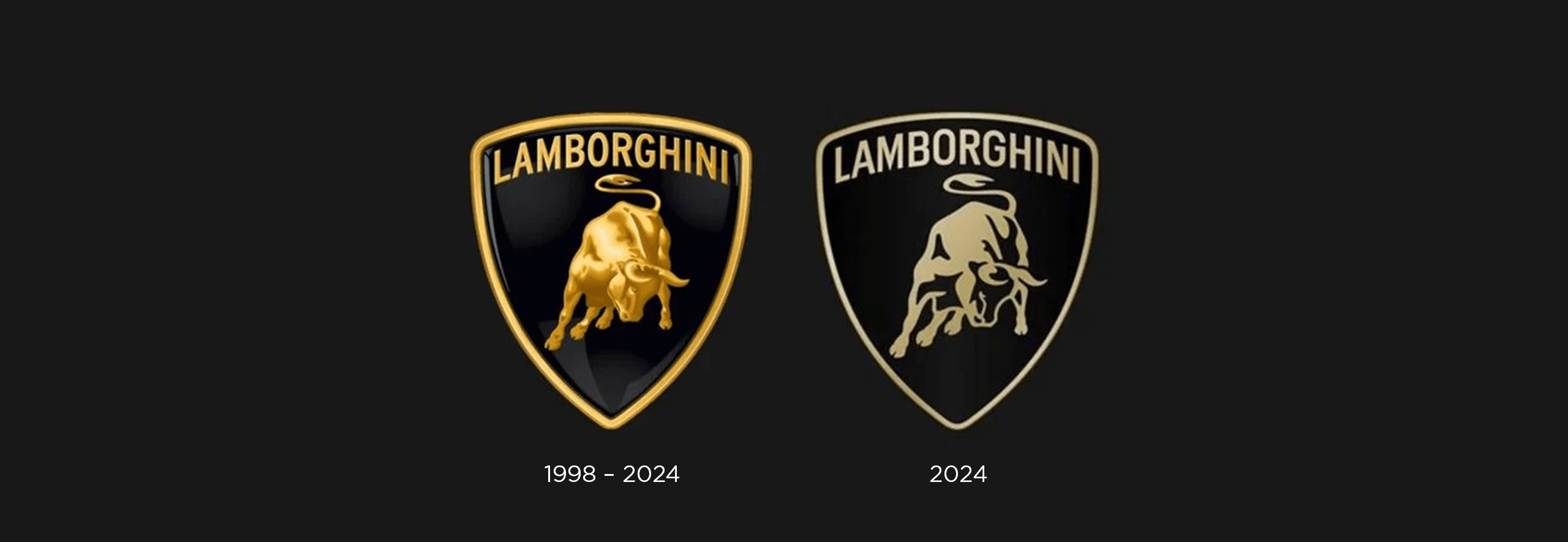
Have you heard? After more than two decades, the iconic emblem and visual identity of Automobili Lamborghini have undergone a rebrand. Unveiling a refreshed logo as part of its new strategic direction, the legendary car company aims to embody its corporate values of courage, innovation, and authenticity, encapsulated in its mission of “Driving Humans Beyond”.

The new logo features a broader Lamborghini typeface and a strikingly minimalist colour palette. Retaining black and white as primary colours reinforces the brand’s distinct identity, while the introduction of yellow and gold accents adds vibrancy. Notably, the iconic bull emblem now stands independently, emphasizing its significance across media.
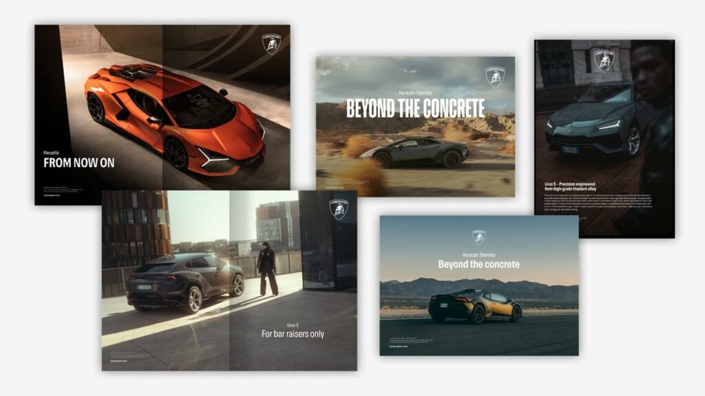
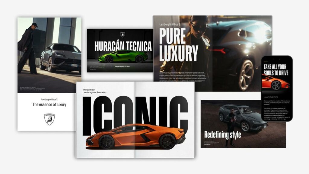
This transformation extends beyond the logo, with the creation of an official Automobili Lamborghini typeface inspired by the sleek lines of its cars. In addition, a new suite of icons were designed in collaboration with Lamborghini Centro Stile, ensuring consistency across digital touch points.
We at Generator think that as far as rebrands go, Automobili Lamborghini has well-refined their iconic brand into something cohesive and effective across platforms with keen awareness of digital application. It serves as an important reminder that even small changes can refresh a business’ image—and that effective logo design is born of careful consideration, research, time and development.
What are your thoughts on this bold-as-a-bull move? Let us know!