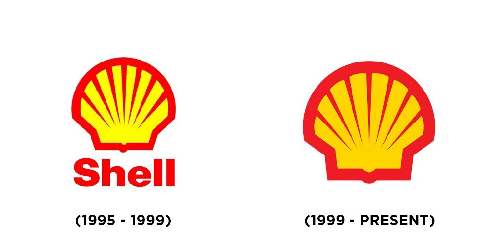
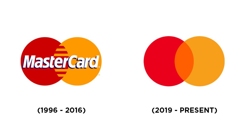
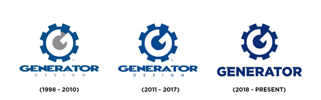
The Simplification Trend
Did it always look like that?
As a designer, you’re familiar with common platforms such as Instagram, Pinterest, Dribbble and Behance. You may have noticed that brand design has simplified. Logos specifically have become more basic with fewer lines, details—and perhaps—less personality. In the world of design and advertising, the term “less is more” is a common belief. As the risk of confusion increases with clutter, the last thing you want is a busy logo.
A logo has a lot riding on it, so the last thing you want is confusion. A logo needs to tell a story without uttering a word. In a world buzzing with constant digital noise, many companies worldwide are following the interesting trend of de-branding.
Hold on a minute: ‘de-branding?’ What does that mean?
This marketing trend is the process of simplifying logos and brand assets, discarding details and even typography. Gradients and highlights are exchanged for minimalistic lines and icons.
So why are companies taking their brand and stripping it down to the basics?
MOBILE FIRST: Logos need to be instantly recognizable on large-format billboards and storefront signs. In our modern age, they also need to be as effective at small scales like app icons on mobile devices. Brands are minimizing details to fit on our screens.
BACK TO BASICS: Every brand is in a race to catch our attention before the competition does. It is within that race that brands have run into design excess; where gradients, shadows and effects once might have held sway, they also risked overshadowing the brand.
LET’S BE PROFESSIONAL: All brands begin with little—if anything—to spend on their identity. As a company grows, so can its logo evolve into a polished and refined look.
A MODERN EDGE: Smoothing out a logo’s details helps to bring the brand up to date, effective even for modernizing analogue brands.
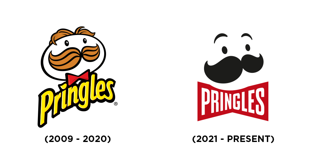

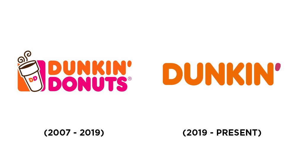
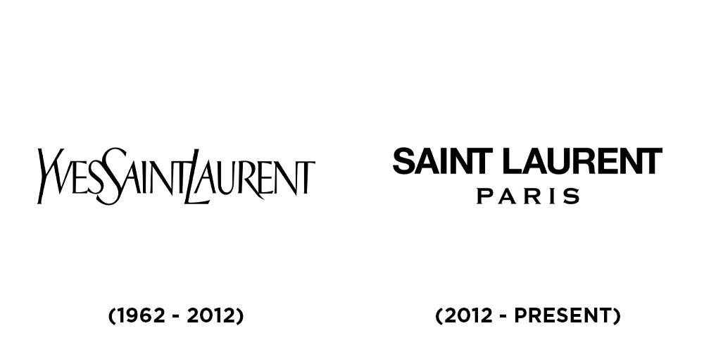
De-branding isn’t a style choice, rather a strategic reflection of how companies once communicated their brand messaging in response to the modern age. Simplified logos have a lot to offer. Brands can reduce their spending output on products, logos gain versatility, and a company’s image is boosted. The challenge is finding the balance between simplification and losing the unique elements that helped to establish the brand.
Whatever the case, today’s consumers want a concise message and it’s clear that the notion of de-branding is going to be around for some time to come.