Logos and Hip-Hop With Jose
For anyone that knows me as a designer, one of my favourite projects to work on are logos. I love logo design; since I was a kid I have been obsessed with it. I remember my first pair of basketball shoes were white and blue Nike Delta Air Forces and they came in a traditional orange box. What I loved about them was that they came with this chunky, thick, orange and clear plastic Nike key tag. That was my first experience with logo branding and packaging. I would trace that logo and key chain until I could draw it by memory—it was so cool to me. Now I bring that same excitement with me on any of the logo projects I do. You can see that passion pour out in some logo designs I have done over the years in our portfolio—shameless plug, sorry.
On the subject of things I love, Old school Hip-Hop music is another great thing that just makes me happy. In my opinion, I grew up in the best era for hip-hop: the eighties and nineties. Hip-hop had this incredible growth spurt at that time and I got to witness it. From Eric B. and Rakim, LL Cool J to Pete Rock and C.L. Smooth—the music and culture blew up.
So what two better things to write about other than logo design and old school Hip-Hop music? Hip-Hop logos had to be iconic and memorable. With their simple designs and marketability, they portrayed the sound and the personality of the artist. I want to share with you my top 5 favourite Hip-hop logos that influenced me as a designer over the years:
5. OutKast
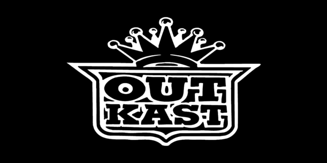
I always love crest-style logos. When I first heard their music and saw the logo, it was the perfect depiction of the Southern Hip-Hop movement at the time. The crown and the Cadillac emblem-style frame with the text gives off a royal feeling. The distressed font also shows off the artistic and experimental style of their music. Welcome to Atlanta.
4. RUN DMC
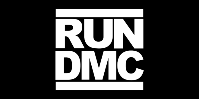
We all know this one. It’s one of my favourites. This logo showed me that less is more and it was the first time I’d seen a sans serif style font used for a logo—it was really effective in this design. The simplicity of this was probably the most essential part of the logo and is what makes it so iconic. Because it’s like that, and that’s the way it is, Huh!
3. Salt-N-Pepa
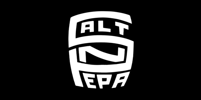
My favourite thing about this logo is the total integration of the names and the initials—that makes the symmetrical side of my brain super happy. I love the distortion and that the logo gives off a graffiti impression, which is pure hip-hop at its roots. Ooh, baby, baby, baby, baby!
2. Public Enemy
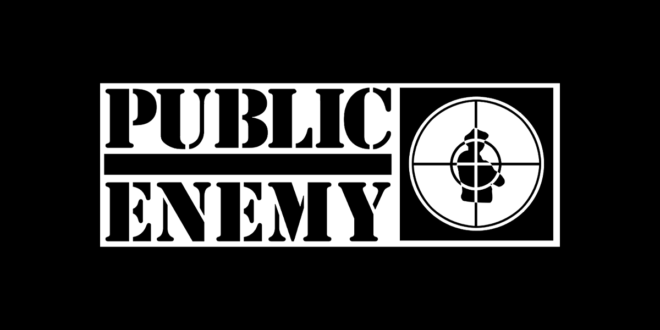
Back in the day I had one of my good friends airbrush this logo on a pair of jean shorts; that is how much I loved this logo. My favourite part of it is the cross-hair graphic, right over the silhouette of a soldier in a b-boy stance. This represented the image of the group well. Yeeeahh boyeee!!
1. Naughty by Nature
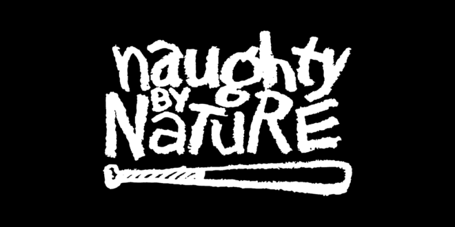
This logo was love at first sight: the typography, the roughed-up edges of the font and the bat graphic depicts the music and overall brand of the group. My first job allowed me to buy a t-shirt and a black and yellow hockey jersey from an ad that was in a hip-hop magazine called “The Source”. I was so excited to get this in the mail that it made me sing hip-hop hooray, ho, he, ho.
So those were my two favourite things; designing logos and listening to some great old-school hip-hop. It is the perfect combo for me. Find your perfect combo and check out some of our logo design. If you have never heard of any of the artists, please do me a favour and give them a listen—they will make your day.


