Dionne Orthodontics: A First Class Flight
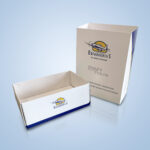
We always have fun working on projects for our long-time client, Dionne Orthodontics. They were looking for a package design to house custom orthodontic appliances. The challenge was to produce a sleek, modern and minimalistic design in the style of packages by Apple or Beats by Dre.
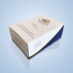
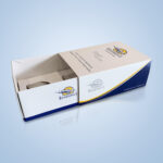
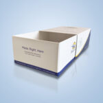
We wanted the product to have a lot of white space; literally. The slip cover is dominated with white and only pertinent information is shown. The sides are also white and share space with the company’s brand colours: blue and yellow, forming a “swoop” that simulates motion and flight, fitting perfectly with Dionne’s aviation motif.
Removing the slip cover exposes the interior of the package which holds the orthodontics appliances. Also minimalistic, the interior provides only necessary company information as well as the company logo, popping right off the stark white sides.
Working on package designs can sometimes be a daunting task. This was anything but; we had fun and worked hard to come up with a product that looks first-class and top of the line. Dionne Orthodontics always comes to us with fun and intriguing design projects and we are always happy to work on them and see them through.
