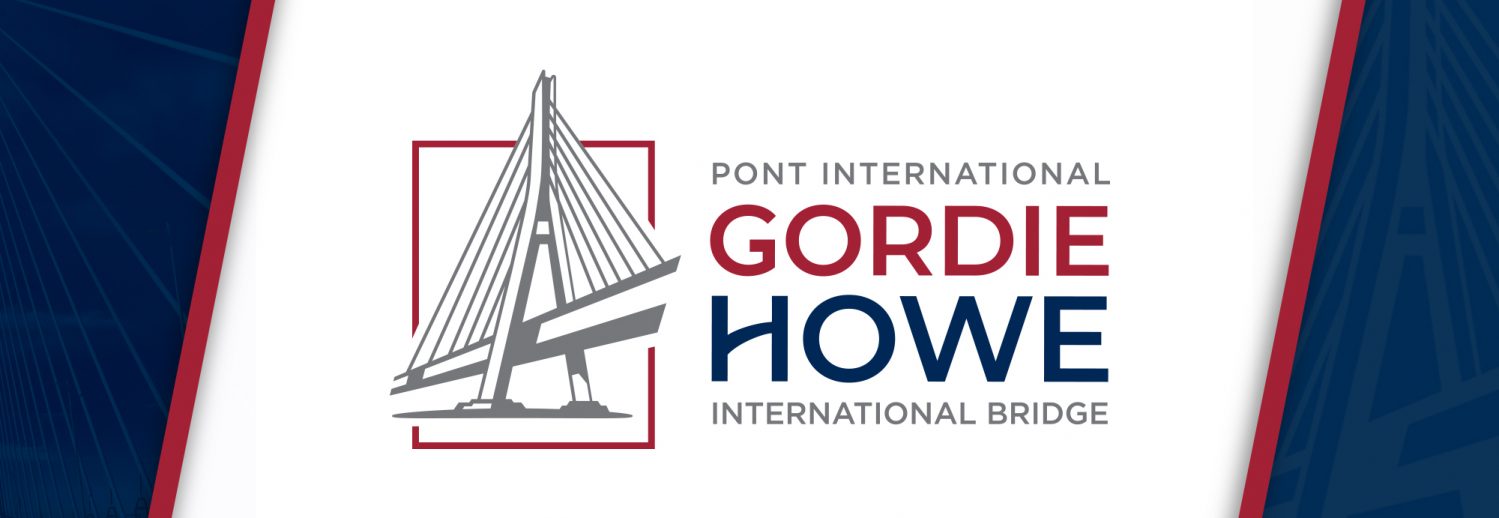
Gordie Howe International Bridge Logo
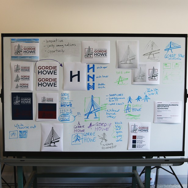
It’s more than just a bridge. It’s a symbol. We had the opportunity to work on this once-in-a-generation undertaking and couldn’t be happier with the outcome. Over many months we conceived, designed and debated over many concepts and ideas.
In this very special post, we will discuss the many components that make up the Gordie Howe International Bridge brand, our design process and how we arrived at the final outcome.
The Task
We had to look ahead to what this logo would represent. It had to embody both Canada and the United States while also having the ability to be recognized and understood globally.
Not only will the project deliver much-needed transportation improvements for international travellers. It will also provide jobs and opportunities for growth to the Windsor-Detroit region.
Key Decisions
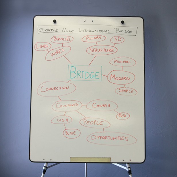
Three important principles were developed at the beginning of the project that would set the tone and direction for the overall brand identity.
A Uniting of Nations – the bridge will be providing much-needed transportation improvements for international travellers as well as a continued relationship between Canada and the United States.
A Wordmark as Strong as the Symbol – a uniquely-styled font or type treatment that can measure up to the visual representation of the bridge.
A Symbol of Opportunity – the bridge will provide many jobs and opportunities for growth to the Windsor-Detroit region.
Creating the Logo
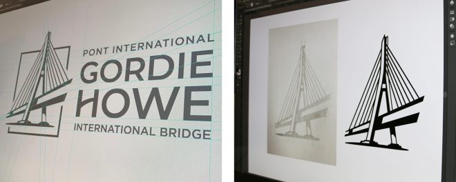
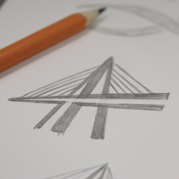
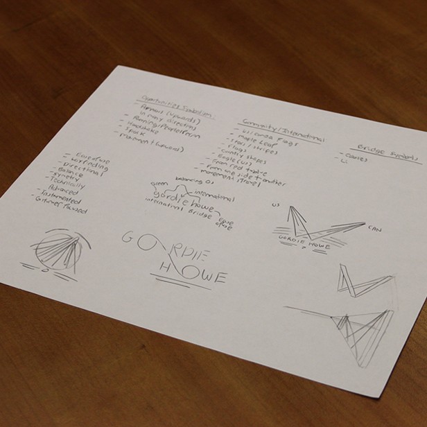
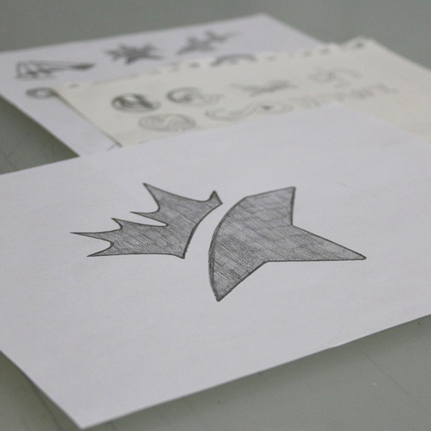
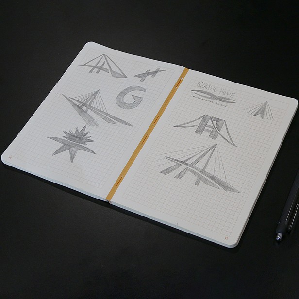
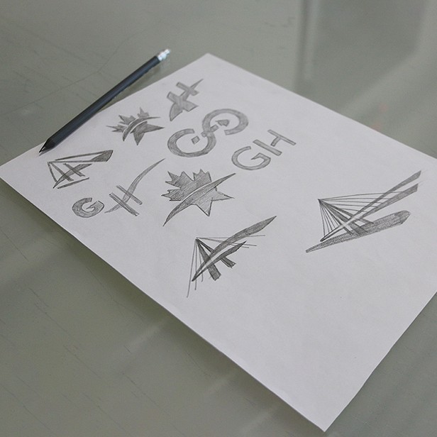
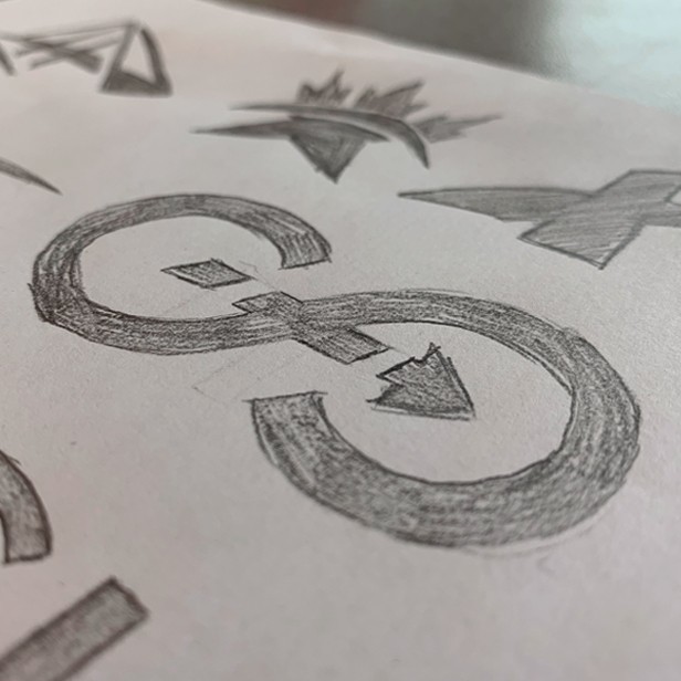
The logo is the face of your business: a visual representation of who you are and what your business is about. At Generator, we collaborated to explore different logo concepts and ultimately designed the final product together.
Final Design
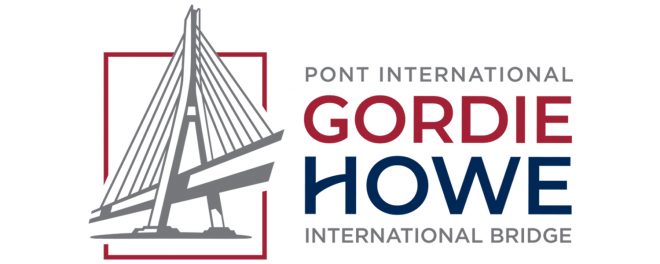
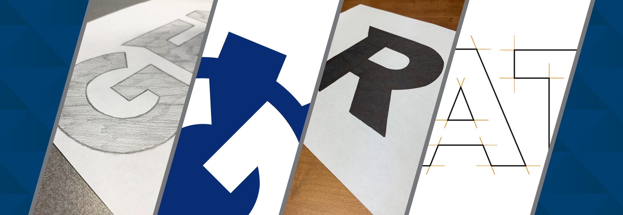
We knew we had landed on something special when we saw the rough sketch for what would become the final logo. The clean lines, the simplicity, the slightly abstract point of view: it really jumped out at us. We had found what we were looking for.
The icon consists of a stylized image of the cable-stayed bridge. Clean, simple and easy to identify, it allows for use in all mediums.
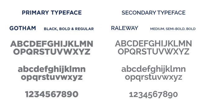
A strong icon needs a strong typeface. We used ‘Gotham’ with just a little bit of refinement worked in to make it stand out. Take a look at that beautiful letter H in ‘Howe’ and you’ll know exactly what we’re talking about.
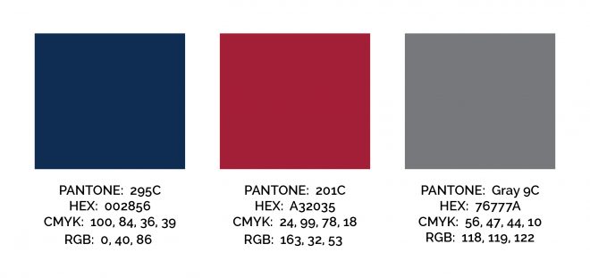
Stacking the typeface helps to keep it contained and easily readable. The two-toned colours represent and identify the international aspect of the bridge.
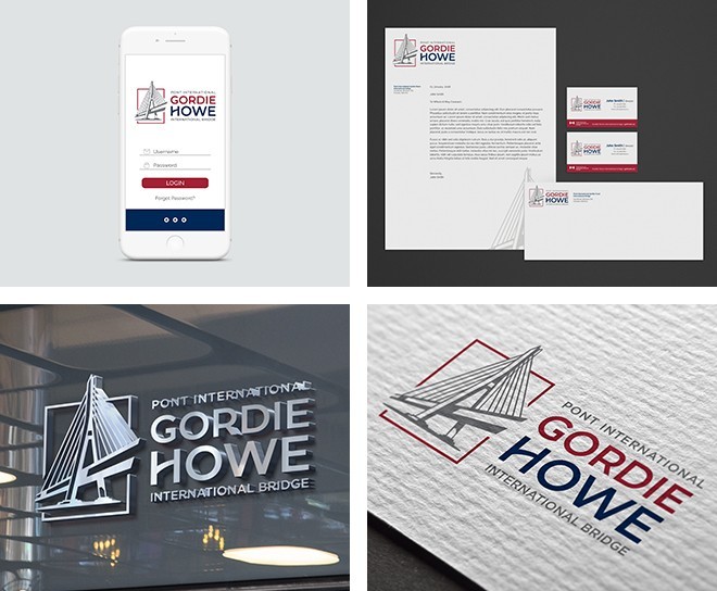
The above images are for conceptual purposes only
Thank you to the Windsor-Detroit Bridge Authority and the Gordie Howe International Bridge for their guidance and support throughout the design process. We’re looking forward to seeing all of the wonderful opportunities the bridge will provide to our community as well as our neighbours across the border.
Find out more about the Gordie Howe International Bridge here.
