The More Hue Know
Ever wonder why a certain colour makes you feel something? Or why so many logos are either red or blue?
For those able to see the full spectrum visible to humans, colour has powerful influence over the choices we make, affecting our psychology more than we realize. It’s kind of spooky and fascinating, but the power of colour allows designers to subconsciously communicate a message without saying a word or drawing a line. But why?
Let’s start off with looking at what colour is. What if we told you that colour doesn’t exist? That’s right! The credit all goes to light. Most humans are able to see a visible spectrum by the name of Roy G. Biv (an acronym for the order in which the colours of the rainbow appear: red, orange, yellow, green, blue, indigo, and violet). This spectrum of light is what makes something look a certain hue; colour isn’t actually inherent in an object. What we perceive to be colour is the light travelling to our eyes which isn’t absorbed by an object’s surface. A red pepper reflects the red wavelengths of light into our eyes and absorbs the rest of the spectrum, just as a blue flower absorbs everything but blue light. Pretty cool. Wait until you see the trick our eyes play on us in the absence of colour:
For the colours we can see, they sure have a lot to say. The same way flowers attract bees, designers employ colours in branding to have some amazing effects on your brain and the choices you make. As the identity of a brand, a logo’s colouration sets the perception of a company even without you knowing much about it. Let’s take a look at some common logos and the psychology of their colours.
Red
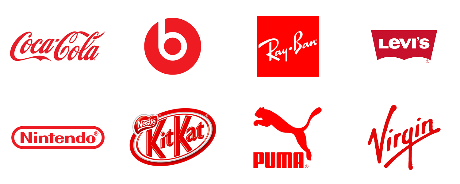
A stimulating colour, red is bold, exciting, encouraging, and energetic. It draws attention as a power colour and is recognized as a stimulant, especially with food. Red is one of the most common colour choices for logos.
Orange
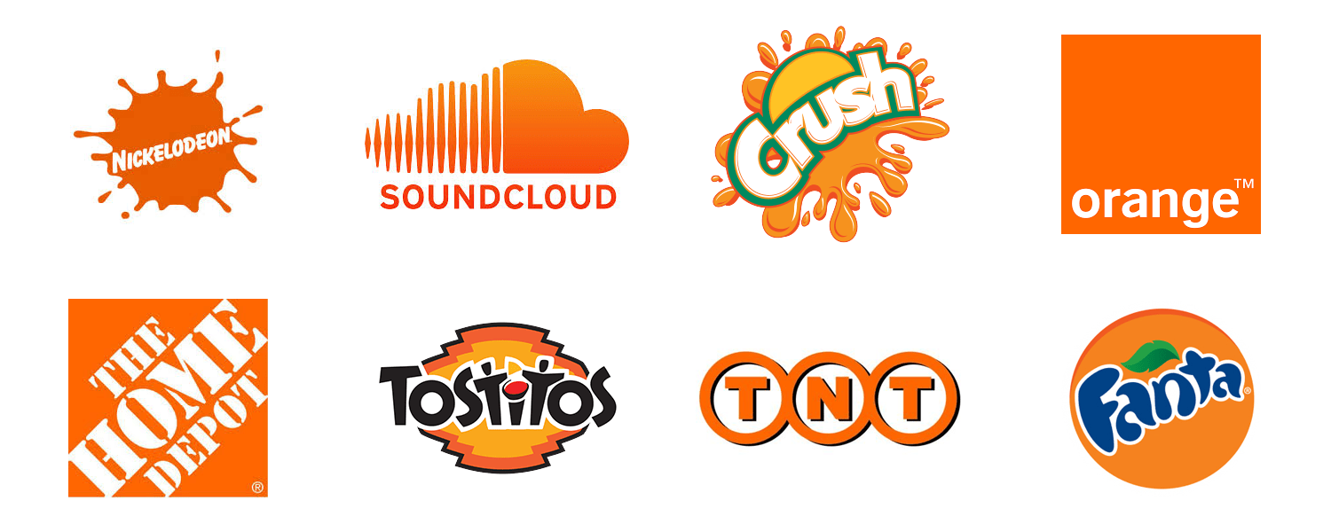
Similar to red, this colour can actually make you feel hungry. Orange is a warm colour full of confidence. Orange wants to be your friend!
Yellow
The bright side of life. Optimistic and enlightening, yellow denotes communication, speed, and helps you remember things.
Green
Fresh and natural, you’ll find harmonious green used for a variety of messages. Being the most common colour on Earth—and the colour most sensitive to the human eye—it evokes peace and rebirth. You’ll commonly find green used in brands promoting a natural or eco-friendly image.
Blue/Indigo
A calm and trustworthy colour, blue is cool, intuitive, dependable, productive, and strong. Blue is a common colour choice for brands communicating their integrity and strong foundation.
Purple/Violet
Creative and eccentric, purple is a balance between red’s energy and blue’s relaxation. Purple is spiritual, uplifting, imaginative, mystical, and wise. Look for purple in science-fiction and indulgent food logos.
Pink
A confident colour, pink has qualities of red without being too aggressive. Passionate, romantic and tranquil, it encourages friendliness; it can also trigger your sweet tooth.
Grey
500 shades of grey: that’s about how many the human eye can detect. While it represents knowledge and non-involvement, grey can also convey pessimism and an unsettling environment. In logo application, grey means expertise.
Black & White
The absence of of colour. Black is sophistication, emptiness and power; a common choice for fashion brands. White evokes purity, neutrality, cleanliness, and clarity—think lab coats and blank pages. Black and white together is a canvas, allowing for a full range of possibilities with other colour choices.
So much can be said with colour, especially as a powerful component applied to logo design. Colour theory is a critical tool designers use to influence the perception of a brand. The right colours can make us crave food, evoke happiness, get us to trust, make us excited to try something, and so much more. That’s why colour choice should always be an important consideration when developing a brand.
So, how about it: what do your brand’s colours say about your business?
