My Top 5 Rock and Heavy Metal Band Logos
Okay, so full disclosure: I’m not exactly headbanging in the front row at every metal show. BUT! I’ve got a serious soft spot for awesome music and even more of a soft spot for fantastic design.
And let me tell you, the raw energy of rock and metal? Totally gets me. It’s all those real instruments, no cheesy samples, just pure, unadulterated artistic passion. Seriously, it’s the kind of stuff that makes you wanna punch the air (in a good way, of course!).
Now, design? That’s my jam. You see it everywhere, and in the world of rock, it’s like designers get to unleash their inner rebels. It’s about capturing the band’s true grit and vibe, no corporate suits telling them what’s gonna sell. So, I’ve put together a list of my top five favorite logos that are seriously face-meltingly cool.

Nine Inch Nails
This logo? It just nails it (pun totally intended!). There’s something so satisfying about its perfect symmetry. I’m a sucker for clean lines and that perfect balance. Turns out, the main man Trent Reznor himself, along with the super talented Gary Talpas (who did art direction and photography for NIN), came up with this gem. Apparently, they were vibing on Tibor Kalman’s typography for the Talking Heads’ “Remain in Light” album. Pretty neat, huh?
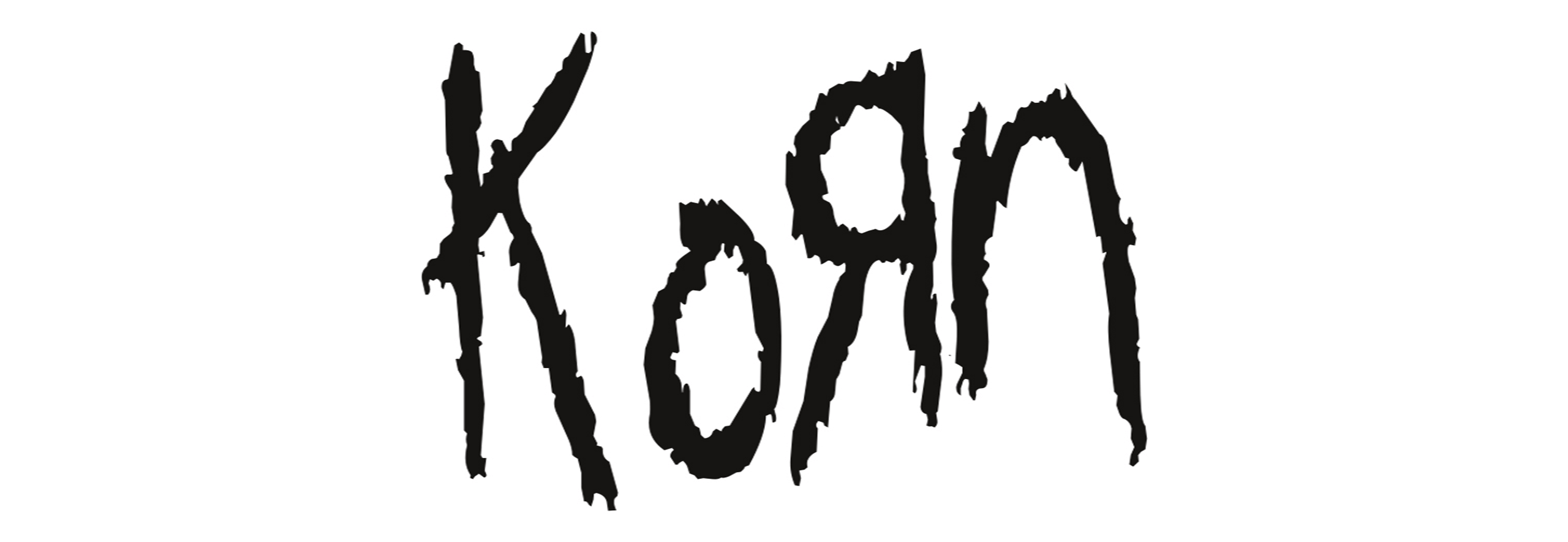
Korn
I gotta say, Korn’s got this crazy energy and style that I’m into. Their sound is this awesome mix of heavy rock with a bit of rap and hip-hop flavor, plus these super creative sound distortions that remind me a bit of the Beastie Boys. The story behind their name and logo is pretty cool too! The band cooked it up themselves, flipping the “K” and “R” to give it this edgy look. Apparently, they got the idea from the backwards “R” in the Toys “R” Us logo, where a bunch of them used to work. Talk about a full-circle moment!
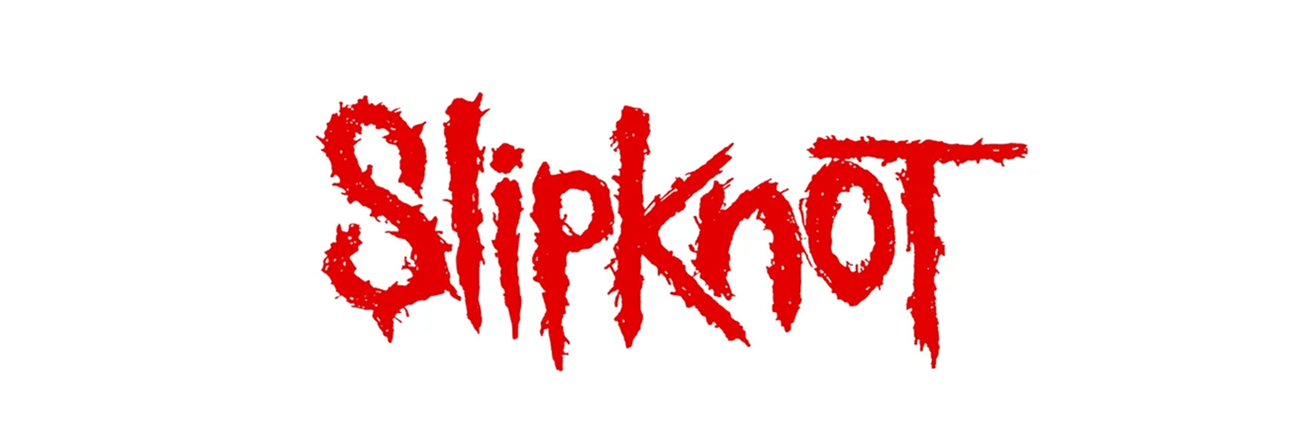
Slipknot
Okay, you HAVE to respect Slipknot’s dedication to their whole brand. From the logo to those insane masks and outfits, all the way to their music, it’s like they’re this one unified beast. I love how authentic and original they are. The logo was actually doodled on a piece of paper by their drummer, the late and great Joey Jordison (RIP in 2021!), and it hasn’t changed since. That gritty texture and lettering? So freakin’ cool and totally captures their sound.

Van Halen
Again, I’m a sucker for simplicity, and this logo is pure iconic genius. Those initials with the wings? Just chef’s kiss. The wings totally scream the high-octane energy of their music. They’ve had a few tweaks over the years with the David Lee Roth and Sammy Hagar eras, but the core design has stayed the same. Seriously, any rock fan sees that logo and instantly knows who it is. Legendary!
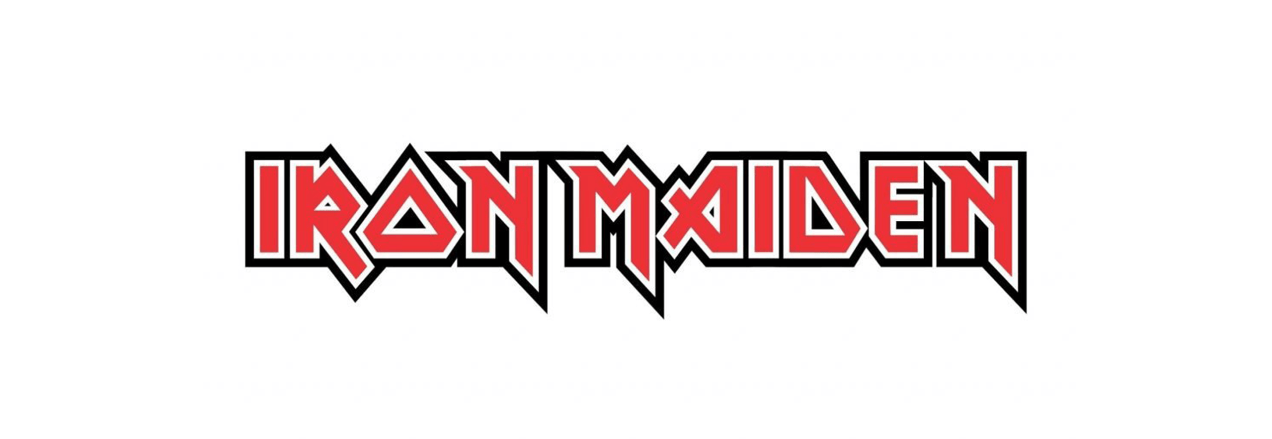
Iron Maiden
Alright, confession time: I haven’t exactly dived deep into Iron Maiden’s discography. But what I am obsessed with is their whole visual identity, especially those wild album illustrations. I remember way back in elementary school, my friends and I would hit up this record/comic book store near our school during lunch. One day, I saw the album poster for “Strangers in a Strange Land,” and it had this classic Iron Maiden-style artwork of a cowboy holding a lit match and a cigar. I thought it was the absolute coolest thing ever, so I bought it without even hearing their music! Yeah, that’s how much of a design nerd I am.
So there you have it! My top five rock and metal logos for now—read here for my top 5 NFL logo obsessions. Design is everywhere, you just gotta keep your eyes peeled and your mind open. ROCK ON!