Visual Design Principles: Why They Matter—Even If You’re Not a Designer
Let’s face it: we live in a world that’s absolutely drowning in visuals. From phone apps to the billboards you ignore on your commute, design is everywhere. And whether you realize it or not, good design makes life easier. Bad design? Well, let’s just say we’ve all struggled with a door that says “PUSH” when it should clearly say “PULL.”
If you’ve ever wondered why some things just look better than others—or why your PowerPoint slides don’t quite have that sleek, professional feel—you’re about to learn the basic principles of visual design. And if you’re a business owner, marketer, or just someone who occasionally makes flyers for your cat’s birthday party, I’ll also explain why hiring a graphic designer might be the best decision you ever make.
The Core Principles of Visual Design

Balance: Don’t Let Your Design Tip Over (Literally or Figuratively)
Imagine playing Jenga, where the goal and art of the tower building game requires delicately removing a block and placing it atop the wobbly structure. Design works the same way. Balance is about distributing visual weight so that no single element overwhelms the rest. You can achieve this with:
Symmetry: both sides mirror each other—classic and stable
Asymmetry: different elements balance each other—more dynamic
Radial balance: everything radiates from a central point—think sunbursts or dartboards
Why it matters: A well-balanced design feels intentional and professional. An unbalanced one feels like it might topple over at any second.
Contrast: Make Things Stand Out (Without Yelling)
Contrast isn’t just about black vs. white—it’s about making key elements pop. This could mean:
Color contrast: dark text on a light background
Size contrast: a big headline with smaller body text
Font contrast: bold vs. light, serif vs. sans-serif
Why it matters: Without contrast, everything blends together like a bowl of oatmeal. And nobody gets excited about oatmeal (no offense to oatmeal lovers).

Hierarchy: Guide the Eye Like a GPS
Good design tells viewers where to look first, second, and third. Hierarchy is how you prioritize information using:
Size: bigger = more important
Placement: top-left is where most people start looking
Color & spacing: bright colours and white space draw attention
Why it matters: If everything screams for attention at once, nothing gets heard. Hierarchy keeps your message clear.
Repetition & Consistency: Be Predictable (In a Good Way)
Ever seen a brand that uses a different font in every post? It’s chaotic. Repetition creates cohesion by:
Using the same colors, fonts, and styles across materials
Establishing patterns (like always placing logos in the same spot)
Why it matters: Consistency builds trust. Inconsistency makes people wonder if you’re secretly five different people running one account.

Alignment: Keep Things Neat (Because Chaos Isn’t a Design Trend)
Misaligned elements are the design equivalent of a crooked picture frame—they just feel off. Proper alignment means:
Text, images, and buttons line up neatly
There’s a clear structure (even if it’s not obvious at first glance)
Why it matters: Alignment makes your work look polished instead of thrown together in a hurry.
White Space: Give Your Design Room to Breathe
White space (or negative space) isn’t “empty”—it’s a powerful tool. It:
Prevents overcrowding
Makes content easier to read
Highlights important elements
Why it matters: Cluttered designs are exhausting. White space is like a deep breath for your eyes.

Scale: Visual Importance Through Size
Scale uses relative size to show importance. A giant headline screams “look at me!” while tiny text whispers “fine print.” Use scale to:
Establish visual dominance
Create depth and perspective
Guide the viewer’s eye
Why it matters: Proper scaling creates clear focal points; poor scaling leaves viewers confused about what matters.
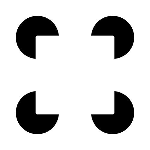
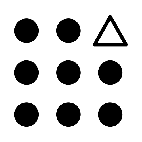
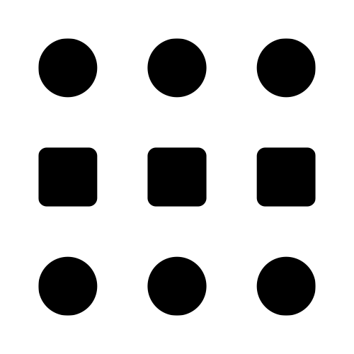
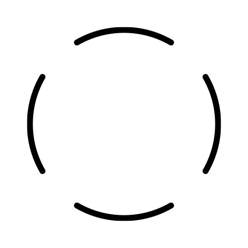
Gestalt Principles: The Whole Is Greater Than the Sum of Its Parts
Ever looked at a logo and instantly recognized a hidden shape? That’s Gestalt theory in action. Our brains naturally group elements to see complete forms, even when they’re not explicitly drawn. Key Gestalt principles include:
Proximity: things close together appear related
Similarity: similar colors/shapes are seen as a group
Closure: our brain fills in missing parts, like the WWF panda
Continuity: we follow lines and curves naturally
Why it matters: Great designers use Gestalt principles to create logos, icons, and layouts that feel intuitive. Without them, things just look…off, even if you can’t explain why.
Why Hire a Graphic Designer? (An Unbiased Argument From Someone Who Definitely Isn’t a Designer)
Now that you know the basics, you might be thinking, “Hey, I can do this myself!” And sure, you could cut your own hair, fix your own plumbing, or represent yourself in court—but should you?
Here’s why hiring a professional graphic designer is worth it:
They Save You Time (And Sanity)
Design isn’t just about making things pretty—it’s about solving problems efficiently. A designer can create a logo, social media graphics, or a website in a fraction of the time it would take you (and with fewer frustrated tears).
They Understand the Psychology of Design
Good designers don’t just follow trends—they know why certain colors, fonts, and layouts work better than others. They use design to influence emotions, guide decisions, and reinforce branding.
They Make You Look Professional
A polished design builds credibility. Whether it’s a business card, a presentation, or an ad, people judge quality at a glance. A designer ensures that first impression is a good one.
They Keep You Consistent
Branding isn’t just a logo—it’s a cohesive visual language. A designer ensures everything you produce aligns with your brand, so you look put-together (even if your desk is a mess).
They Help You Stand Out
Templates are great… but so many people use them that your work can end up looking generic. A designer creates custom solutions tailored to your needs.
Final Thought: Design Matters More Than You Think
Whether you’re running a business, promoting an event, or just trying to make your resume look less like a ransom note, understanding visual design principles helps. And if you want results that truly shine? A professional designer is your best bet.
Now, if you’ll excuse me, I I need to go fix a tpyo that’s been bothering me all morning.