
What’s In No Name?
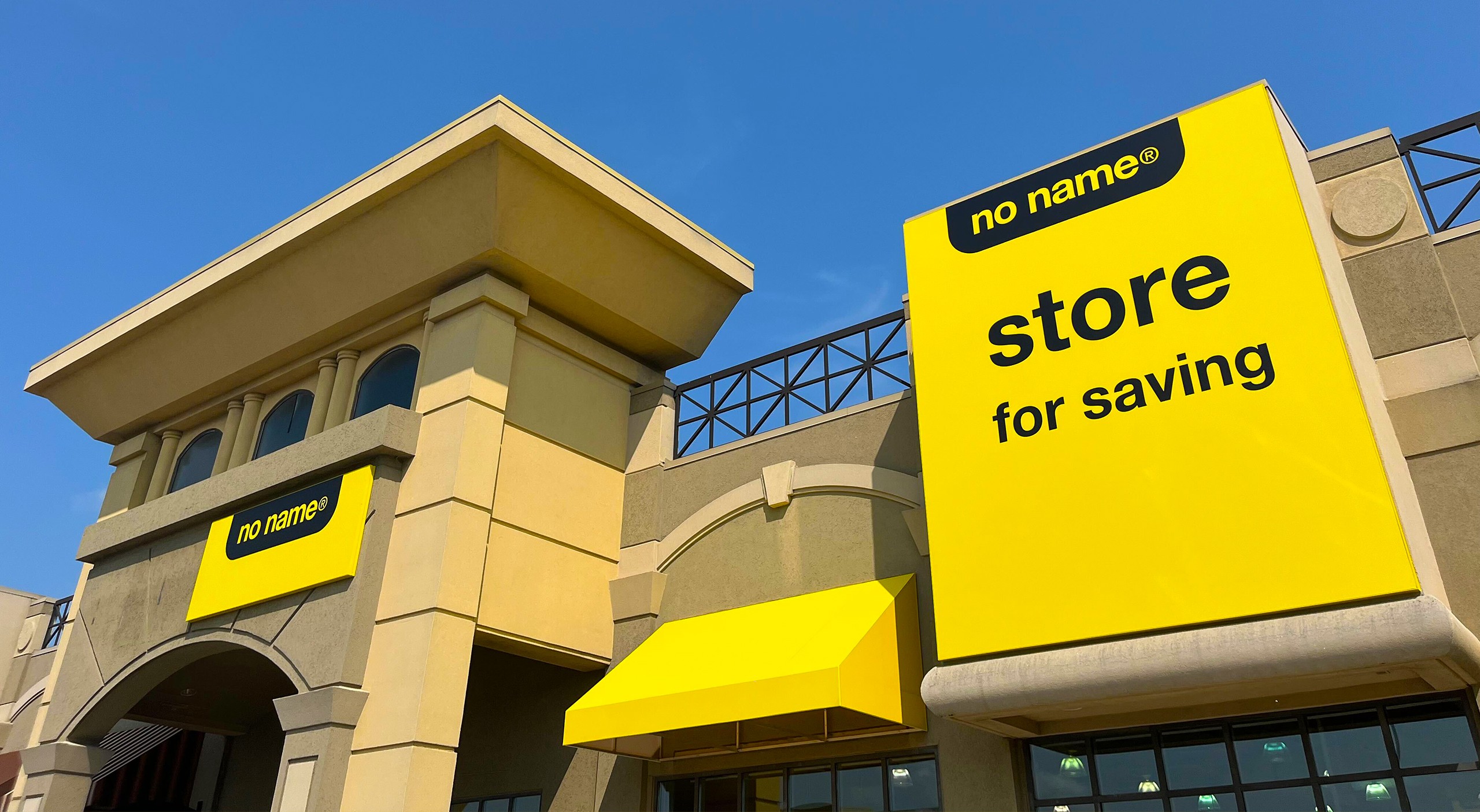
In the middle of September, my family and I took a trip out to Windsor Crossing. While groceries weren’t on the list for the day, something yellow caught my eye in the long line of outlets. It was the first-ever No Name store we had heard so much about in recent weeks, offering the ultimate in minimalist grocery shopping. My designer’s brain auto-navigated toward the store; I simply had to know how No Name would brand bananas.
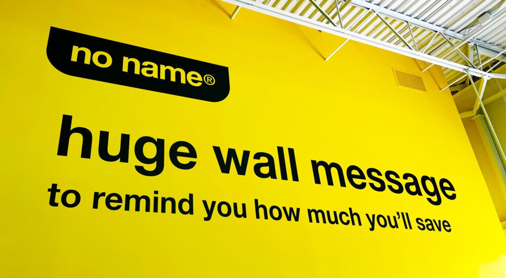
At risk of sounding cheesy, as soon as we entered the store, I felt I was at an art show. We’re talking a head-to-toe, everything branded, immersive experience. Coldplay said it best: it was all yellow.
The Making Of A Brand
Unmistakable yellow packaging with bold, black Helvetica type. No Name has become as Canadian as maple syrup—or at least, as ubiquitous as a Tim Hortons drive-thru. This no-nonsense branding was dreamed up by Don Watt, a Canadian graphic design legend. His minimalist magic turned a discount brand into a national icon. Hired by Galen Weston Sr. in 1973 to revive a struggling Loblaws, Watt didn’t just slap some yellow paint on things. Revolutionizing retail branding, creating a cohesive, in-your-face system that would make any design nerd swoon, he also cooked up the President’s Choice brand. Even fancy things need good type treatment.
Watt’s genius was more than skin-deep. A true retail visionary, his idea of branding went beyond logos. It was about ensuring everything from packaging to store signage to promotional flyers worked together like a well-organized pantry. He applied this method not just to Loblaws but also to household names like Walmart, Safeway, and Home Depot, where he masterminded the legendary orange-and-white logo. Clearly, this was a designer who understood the power of colour theory.
When Loblaws launched No Name in 1978, followed by the first No Frills store in Toronto, it became clear that Watt had found his sweet spot. The brand’s design was a masterclass in making simplicity stylish. Yellow packaging so loud it practically yelled, “I’m affordable!” at you, while the Helvetica text stayed cool and understated. It was the kind of design that whispered when you got up close, “Who needs frills when you have savings?”
But Watt’s influence didn’t stop with Canada. He took his talents stateside. Helping Walmart launch its private label brands like Sam’s Choice and Great Value, he continued flexing his design muscles with Metro and Super C when they needed a rebrand. He even got his hands on Nescafé in the ’60s, reportedly becoming the first to use photo-symbolism on packaging. Watt made coffee jars photogenic before Instagram was even a thing.
I’m glad to have had the opportunity to see such an iconic brand and piece of design history launched here in Windsor-Essex. As a designer, it’s nice to see that decades later the original No Name branding is still going strong. Watt’s minimalist vision remains intact, proving that sometimes, less really is more—especially when it comes with deadpan copywriting and bright yellow packaging.
Disclaimer: We love design. Generator Design’s views were not endorsed or paid for by Loblaws or its affiliates.