Punk’s Not Dead… But Correcting Typos Is
In late October 2024, 60,000 time-travelling millennials flooded into Las Vegas, not for gambling and debauchery, but for the third annual ‘When We Were Young Festival’. This event is a weekend-long trip down memory lane for aging punk rock/emo/post-hardcore fans.
Slipping back into their Vans kicks, attendees dug out their favourite mothballed concert t-shirts and took their back pain medication as they prepared to experience Motion City Soundtrack, Taking Back Sunday, My Chemical Romance, Simple Plan, Cartel, and many more.
You had to be the right age for this sort of music, like I was between the years 2000 and 2010. Just seeing the lineup for this festival had me wishing I could jump with my former youthful enthusiasm. Admittedly, I looked into ticket prices, flights and accommodations, but rethought everything; I now have kids, a career, mild neck pain, and got a little sleepy just thinking about going.
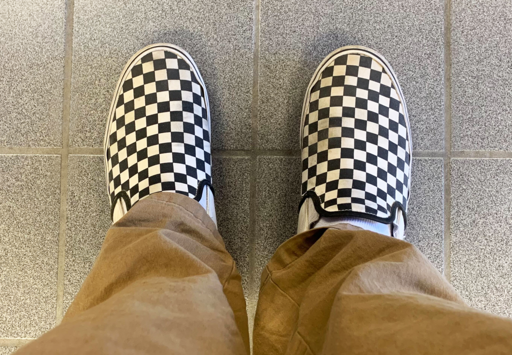
Alas, I settled back with my Starbucks and caught up on some reading. Indeed: I’ve lost most of my punk rock credentials… but I still wear my Vans checkered kicks!
It goes without saying that I loved the ’00s for music and appreciated the paraphernalia and swag associated with it. And then, something caught my eye.
Something happened with this festival that just got under my skin and incensed me as a graphic designer.
As reported by several outlets, the official ‘When We Were Young’ merchandise is RIDDLED with spelling errors.
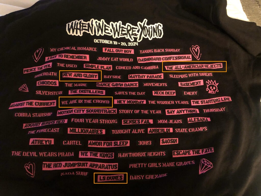
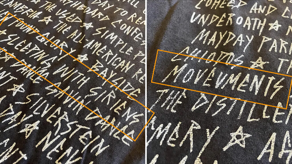
The official count is that at least eight bands’ names were misspelled across several official merch items:
- The All-Amercian Rejects (The All-American Rejects)
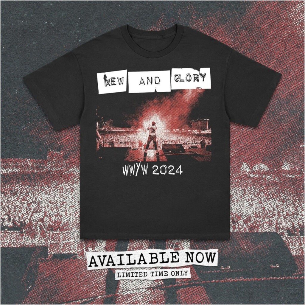
- New And Glory (New Found Glory)
- We Are In The Crowd (We Are The In Crowd)
- Sleeping With Siriens (Sleeping With Sirens)
- Movevments (Movements)
- Amor For Sleep (Armor For Sleep)
- LS Dunes (L.S. Dunes)
- Daisy Grendade (Daisy Grenade)
One could argue that omitting the periods from L.S. Dunes may be more of a style thing, but come on. These are some rough errors. We all make typos, myself included, but I’m professional enough to catch them—or have the Generator team proof my work, this blog included.
Yes: I’m being critical of this because it’s an assault on both my nostalgia and my industry. I feel this is plain old lazy graphic design and the fault lays upon a designer and an art director. It’s not like they were editing a 400-page novel and missed a few typos—it’s 60 band names. How did any of these slip by? Let’s explore:
LAZY GRAPHIC DESIGNER: Truth be told, I’m not passionate about every job I work on, but I am disciplined enough to proof my work. I speculate that a graphic designer who wasn’t familiar with these artists took on the job. Maybe they weren’t available, but this job should have been assigned to someone who grew up with the bands. Or at the very least proofed by others, including event management.
OUTSOURCED DESIGN: I’ve been observing an industry trend lately: design work being farmed out globally where English may not be a first language. Anything to save a buck. Considering the amount of overlooked typos in the event merchandise, I see this as a likely scenario.
POOR SUPERVISION: Whatever project I work on gets double-checked by at least two other designers before being sent to the client for approval. Considering the popularity and magnitude of this festival, I find it hard to believe that these designs were left to one person who never had them reviewed for spelling and grammar.
So how can troublesome and embarrassing errors such as these be avoided?
SPELL CHECK: It’s a no-brainer. One can argue that a spell check is moot in this situation as these are band names not necessarily following the rules of proper spelling and grammar. The designer should have just copied and pasted from the provided band list and adjusted the type design and effects accordingly. Or maybe they did, and the list was wrong. Who knows?
USE THE INTERNET: If the designer was unfamiliar with or uncertain of the proper spelling of the band names, the internet would have supplied the answer, no question about it. Special attention should be paid to band names: the name may be strange (3OH!3) and their syntax may be unconventional (Armor for Sleep).
GET A PRO TO PROOFREAD: Send it my way! Barring that, have a couple of extra sets of eyes read it over. Every ad agency and design firm should never leave any project to just one person, especially when it comes to proofreading.
The pop punk mainstay New Found Glory—one of my favourite bands—were on the bill for this event, and unfortunately one of the typo-affected bands. The band took the botch-job in stride; never content to let an opportunity go to waste, the group have released a limited run of t-shirts featuring the typo and stated:
“If you know you know! The festival merch this weekend “renamed” a bunch of bands which was good for a ton of laughs. And ya know what? We liked ours so much we’re considering just changing our band name. For a limited time test run, here’s our first New And Glory T-Shirt.”
So what can be learned from this? While this wasn’t a world-ending mistake, it may have been a career-ending one for some poor designer. Typos happen. And like I mentioned before, I make them as well. No one is immune from this occurrence, so make sure to check your work, check it again, and have others check it, too. It’s as simple as that.
