Retro Specs
Trends are a mixed bag. For some, they are something exciting to look forward to every year. For others, adopting them would be too mainstream. What people don’t realize, though, is that the effect of a trend goes deeper than they may think and at its core a trend may simply be history repeating or reinventing itself.
Design in 2016 is no exception. Certainly as a whole, trends are the brainchildren of the world’s designers. As these goods and concepts flood the consumer market, romance develops and people accommodate to their presence. Assimilation affords security, belonging and the assertion that one is up with the times.
And time and time again, design is challenged and upturned. Once in a while, it is shaped into something so useful and perfect that it attains timelessness. Ahead are some of the 2016 trends going full throttle in the industry which have seen heydays in one or more decades.
Material Design
Coined by Google, the concept of material design aims to provide visual cues about how to interact with web objects, with roots in reality. Today’s application pairs subtle effects to suggest motion, tactile quality and function with a user-friendly interface. In the Internet boom of the 90s, material design was not yet a label, but an untitled expectation of user interface. This meant designing web buttons wrought with embellishment and every lighting effect in the book to beckon usability. Material design is the refined take on this practice, using minimal effects to hint at form and function.

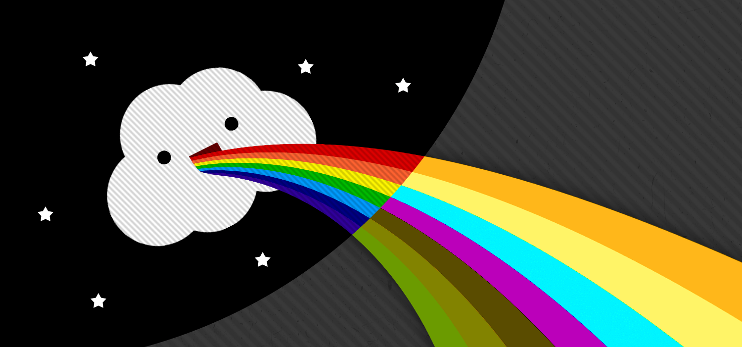
Bright, Bold Geometry
New UI frameworks and templates have prompted designers to begin pairing vibrant colours with minimalism in their designs. This approach offers a visually striking, simplified grid system where elements are enhanced with colour and geometric shapes. Over forty years ago, the same revolution was being applied to advertisements. The 70s saw printing advancements in colour and paper, providing vivid options for designers to work with. Now, with digital advancements all but replacing paper ads, flat form, bright colour and engaging negative space have made their comeback without restriction.
Negative Space
Negative space, also known as “white space” due to a long history of black ink on white paper, is the identification of separation. This less-is-more treatment aids in the fast absorption of content. In application, it is used to draw focus to the main subject, or the positive space. The effect can be subtle, allowing for negative space to form a true subject of a design. Negative space is timeless. In today’s fast-paced world, it allows for messaging to speak with volume and clarity through effective organization of elements, telling eyes where to look and brains what to remember in a short amount of time.
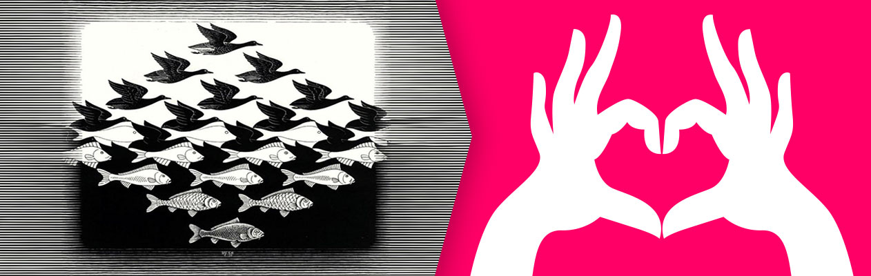
Left: Escher, M.C. (1938). Sky and Water
Modular Layouts
Grids are a designer’s best friend. Steeped in theory, modular design offers a solid foundation for organizing content. Easy to work with across media, its best function is the ability to harbour assorted content together in one comprehensible format. By the 19th century, newspapers caught on to an orderly way of featuring multiple articles across sheets, a mainstay of the print world with reinvention in web design. Responsive design benefits from modular layout when transitioning from desktop to mobile device viewing, allowing blocks of information to be stacked and retain original design elements.
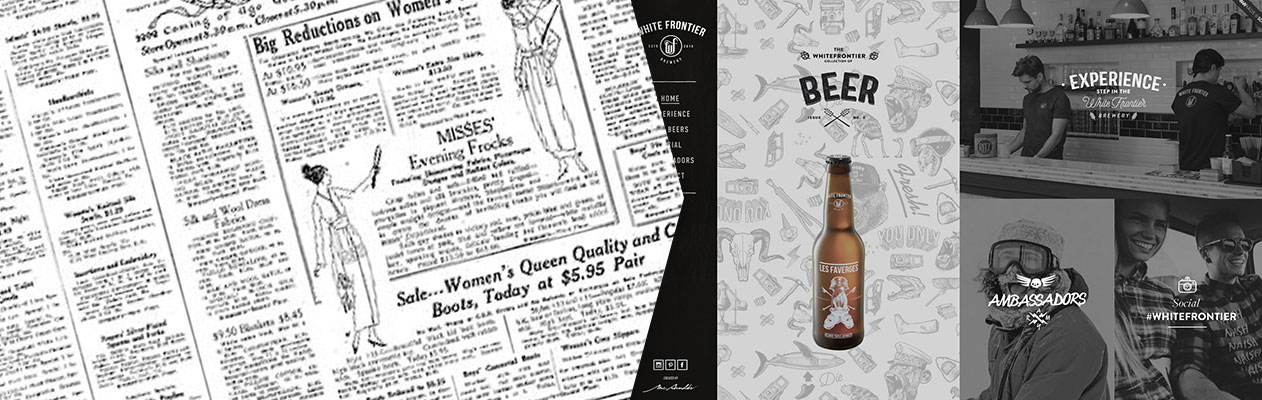
Source: Wikimedia, White Frontier Brewery
Dramatic Typography
Building on the modular layout of 1800’s newspapers, the need to further distinguish otherwise monotonous content led to the rise of another trend we see today: dramatic typography. Bold headlines of varying weight vying for attention amidst a sea of text broke up articles, facilitating the digestion of information. By the 20th century, publications began running articles with larger, more engaging headlines, prompting the decline of multiple decks and the additions of fine lines to differentiate columns. Today, this large type works to add drama. Accomplished through typefaces and placement of letters and whole words, text is realized as design itself, juxtaposed with different fonts, stacked, or over top large imagery. The staying power of dramatic typography is evident in the trend of its reinvention every few years and is in no sign of decline in 2016.
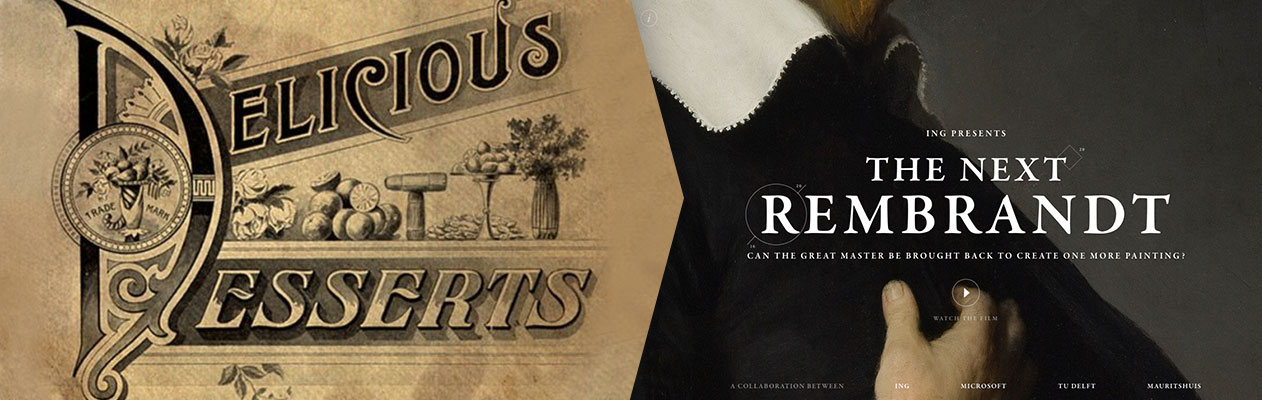
Source: Vintage Me Oh My, The Next Rembrandt
Custom Imagery
With the purpose of attracting attention, providing clues or summarizing an article, custom imagery is on the rise. Battling the overuse of available stock imagery, illustrators and photographers can benefit from producing new concepts for use across media. Prints were a fixture of the Victorian era onward, accompanying ads and announcements tailored to their messages. Just as true today, custom spot illustrations engage the viewer by providing something fresh, even if the main content is familiar or would otherwise be glanced over. Much like an engaging headline, custom imagery paints an attractive overview of a topic, amusing the viewer and enticing full absorption of a message.
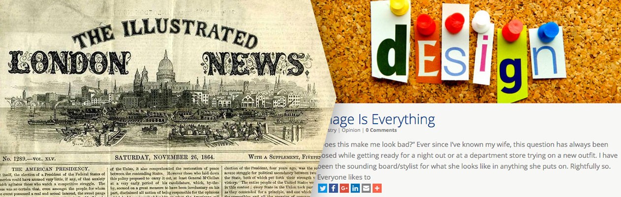
Source: Wikipedia
Minimalistic Style
After post-World War II art, minimalism gained strength in the 60s and 70s. Referred to as “literalist”, “minimal” and “ABC”, it is the art of removing all but the bare essentials. Useful in user interface design today, minimalism works harmoniously with material design and modular layout, allowing for a comprehensible experience without challenging the user. Negative space generated from minimalism, guides the eye to core content without supplemental design effort and is an effective tool in all applications.
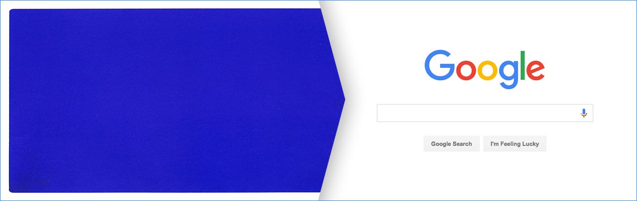
Source: Left: Klein, Yves. (1962). IKB 191, Right: Google
2016 and beyond will surely see its share of reinventing the creative wheel. For the most part, these design trends have evolved primarily in response to better communicating messages. Yet designers and artisans throughout time have pushed boundaries and crafted new ways to simultaneously stand out from the crowd and unify the masses. What was popular once and then forgotten for decades can always be revisited, redefined and revitalized for a new set of eyes. And through it all, the world of design can expect to find that these golden rules form the very framework of the next big trend.